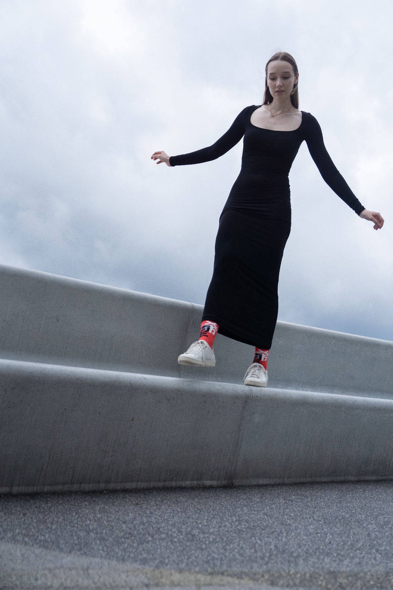
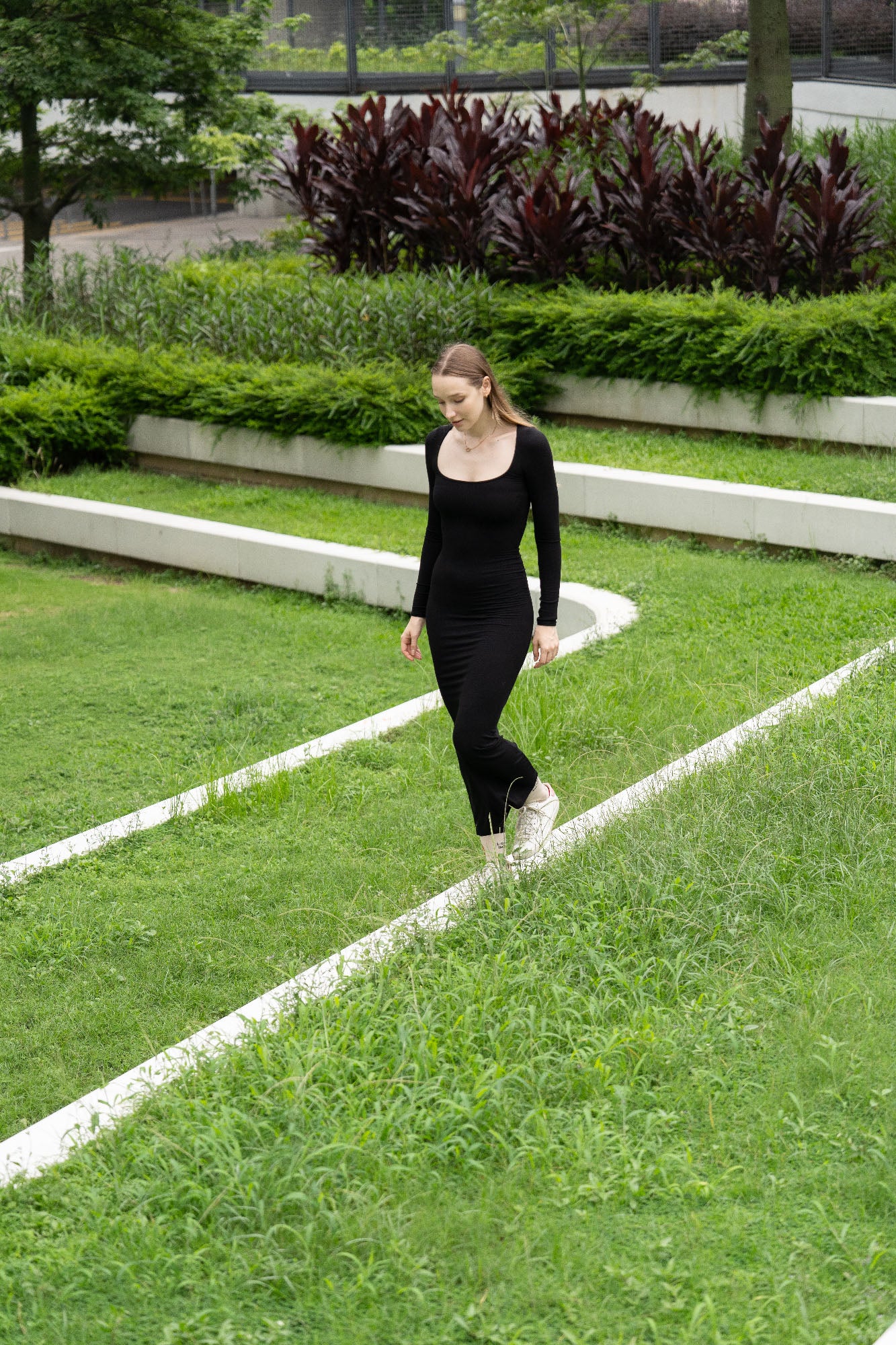
Lookbook
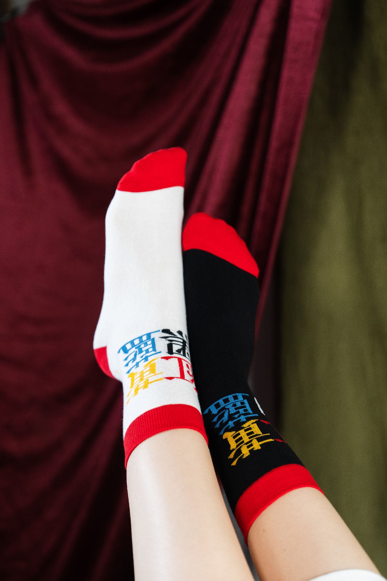
New/Old
The New Old socks presents a playful experiment in exploring the contrast between the "new" and the "old." It cleverly splits the Chinese character "新" (meaning "new") in half, with one side rendered in a modern typographic style and the other half depicted in traditional Chinese calligraphy as the character "舊" (meaning "old"). This visual juxtaposition creates an intriguing narrative about the coexistence of the contemporary and the vintage.
Eurasian Face Socks
These socks feature a blend of Western and Eastern facial features, combining a white face with blue eyes and a yellow face with black eyes.
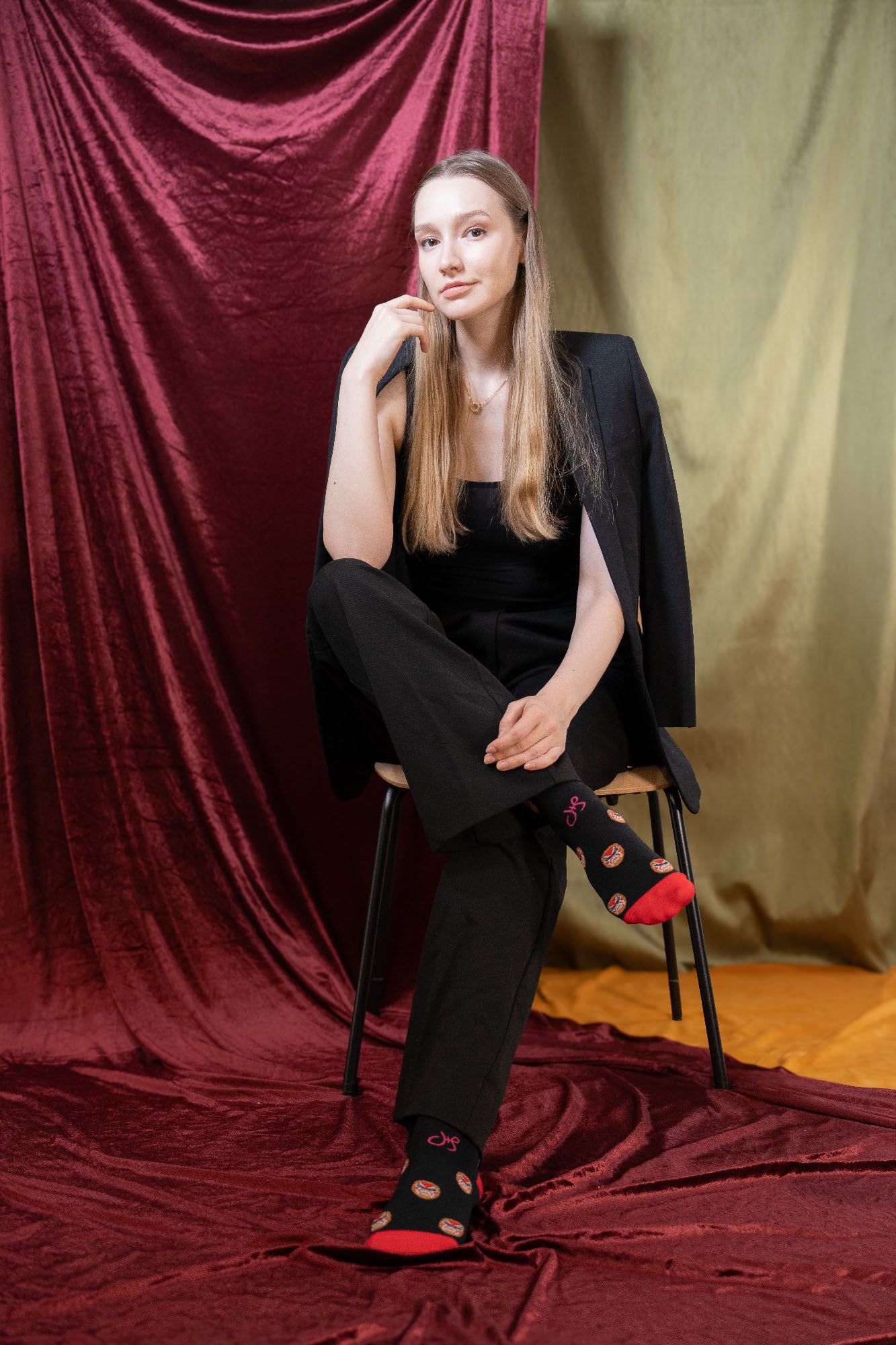
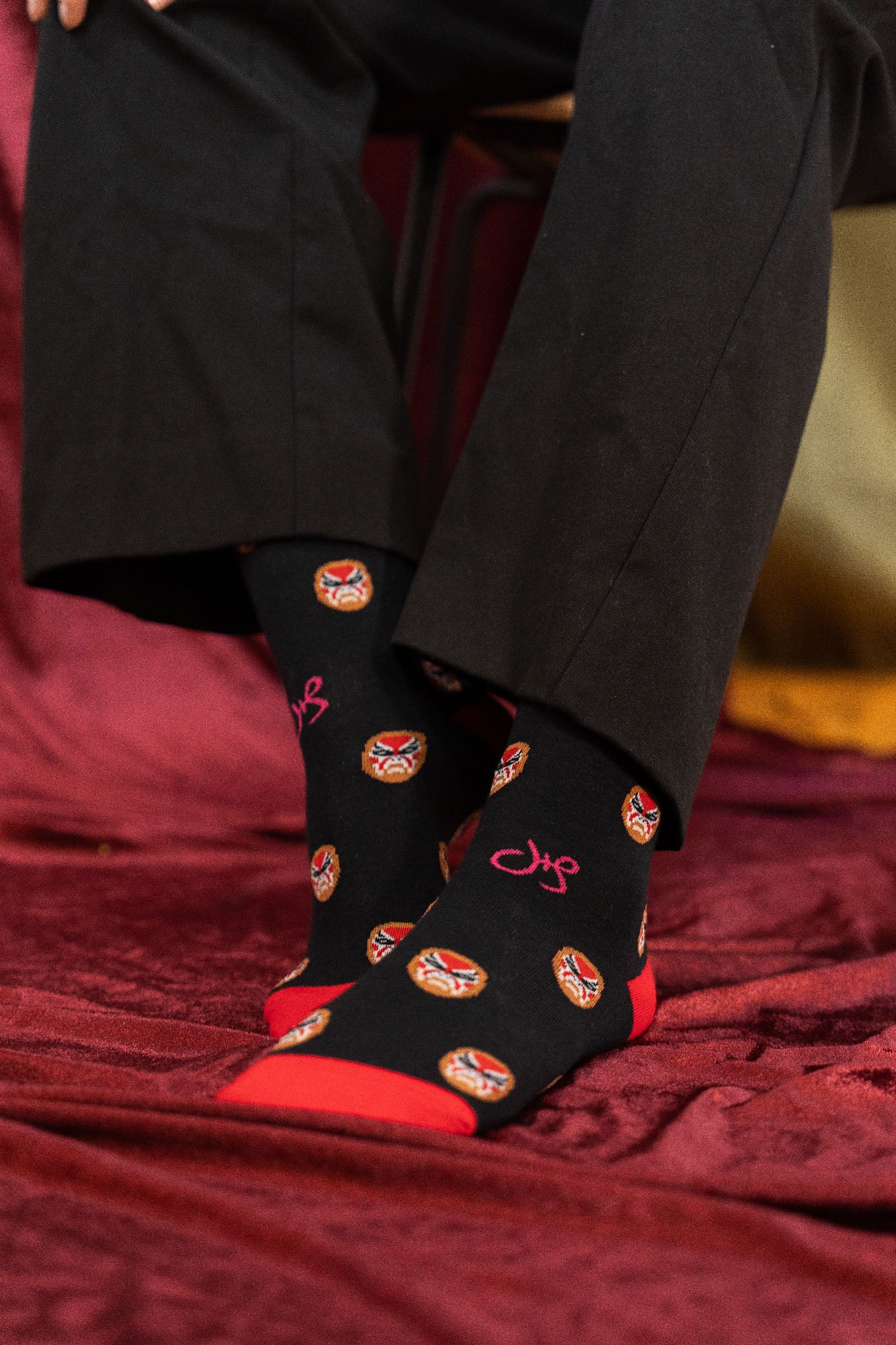
Opera Mask Socks
This design was inspired by the Henry self-portrait when he sits suited up in a chair with a Peking opera "Hualian" (painted face). This socks captures Henry's expression to his path as a cross-cultural designer.
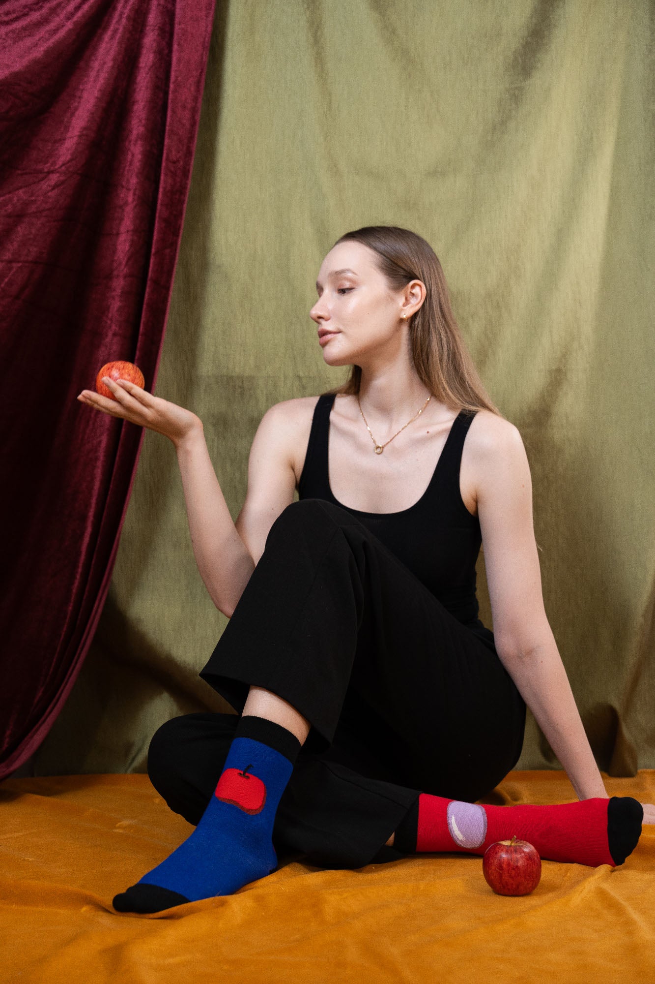
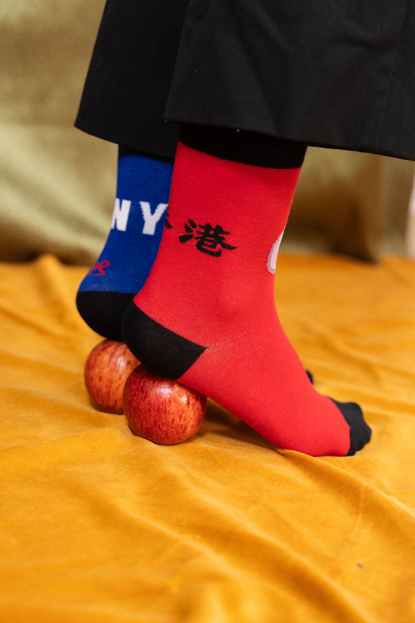
Apple/Pearl Socks
For an HSBC annual report cover, the apple and pearl was designed to put together a direct comparison between western and chinese culture. These socks draw a direct comparison between two iconic financial centers - the "big apple" of New York and the "Pearl of the Orient" of Hong Kong. The socks playfully present one side with an apple and the other with a pearl, allowing the wearer to visually showcase this cultural contrast.
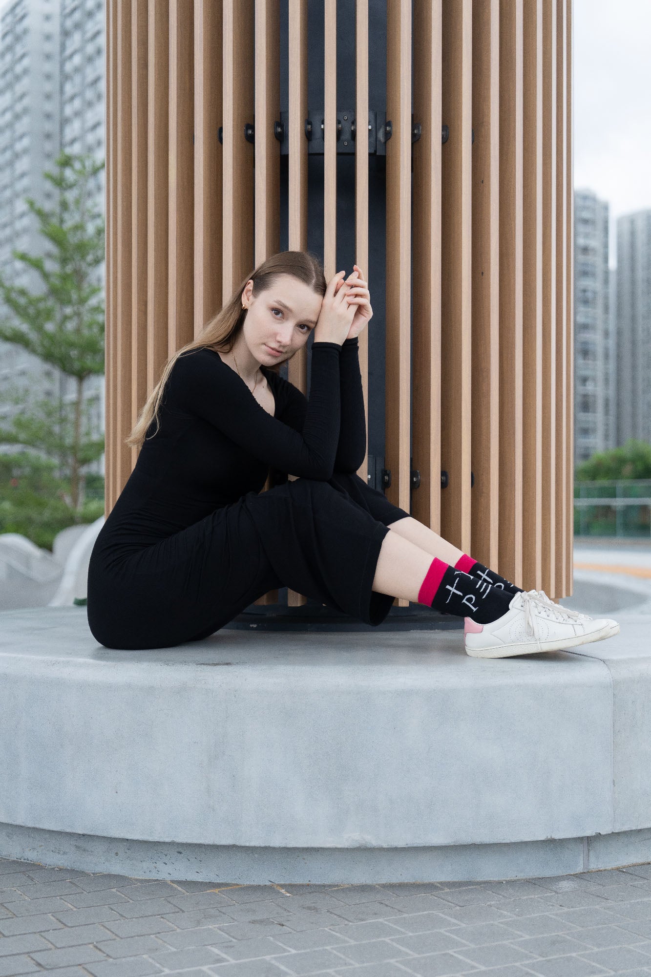
TYPE Socks
The original TYPE poster was designed in 1991 for the Japanese typesetting company Morisawa. The concept behind it was to blend different cultural elements into a cohesive word. The Chinese characters "十" and "三" represent the English letters "T" and "E", while the Greek letters "Upsilon" and "Rho" stand for "Y" and "P". All these diverse characters are harmoniously integrated with a Japanese logotype cover of the magazine “Katakana”. This TYPE socks design successfully captures this bold fusion of cultures, which is Henry's favourite choice.
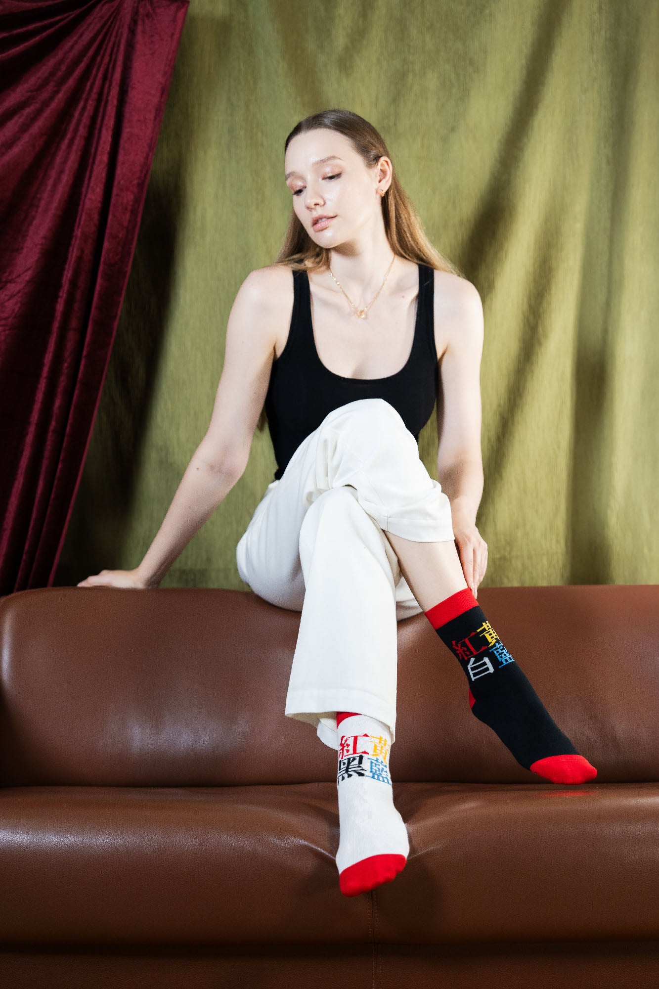
COLOR Socks
The COLOR socks design beautifully demonstrates the idea that "color is the universal language." By pairing Chinese characters with their corresponding color representations, this concept is made accessible even to those unfamiliar with the script. The playful use of contrasting white and black backgrounds on the socks adds an engaging touch.
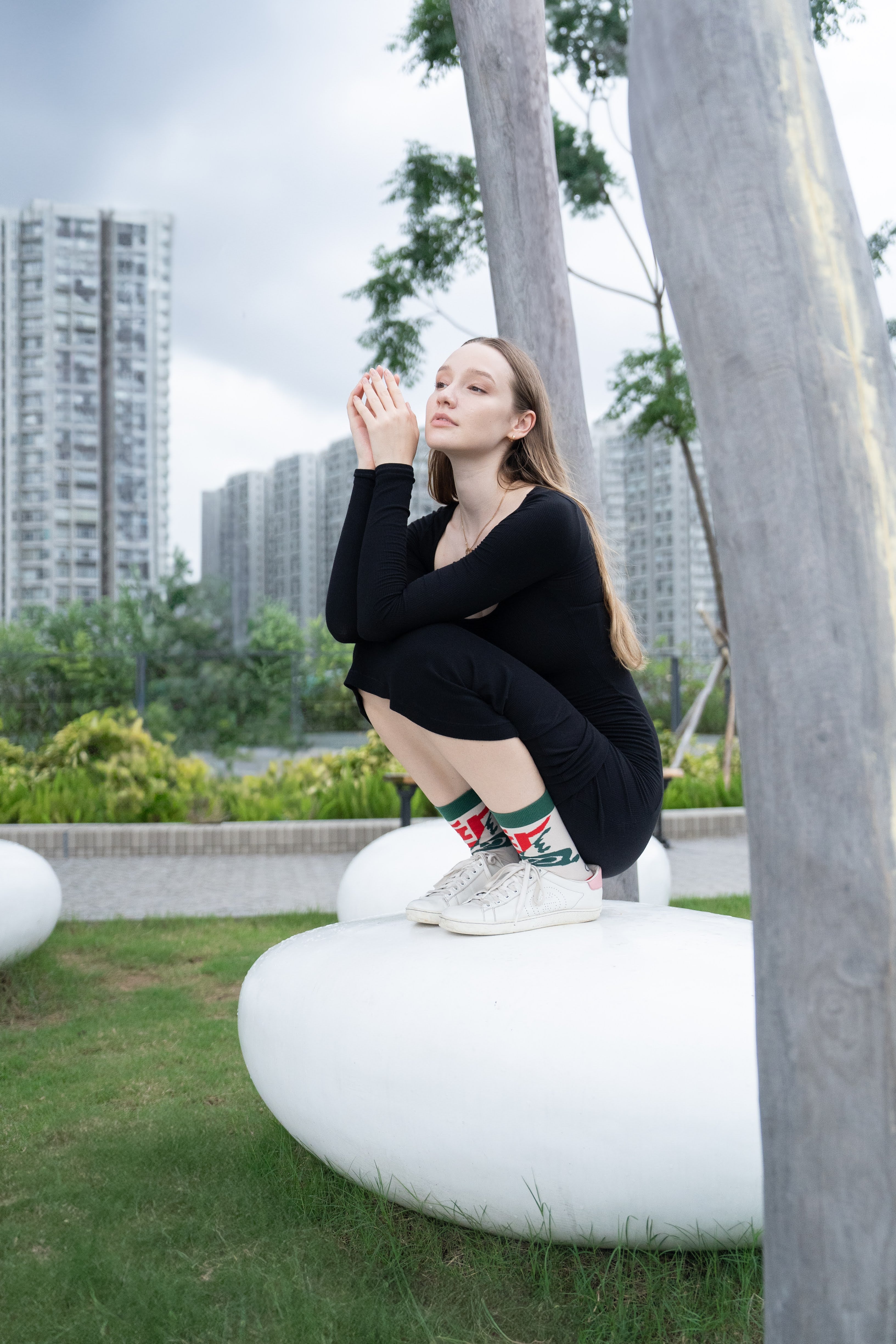
Hope Socks
"HOPE" was originally created for the cover of Asia Magazine in 1961. It highlights the Chinese characters "希望" (meaning "hope") and uses a vibrant red color to convey a sense of optimism and aspiration.
Ban the Tie!
This design was created to challenge the common dress code requirement for men to wear ties when attending the opera or a concert. Especially in Asia, where air conditioning was not as prevalent in the past, wearing a tie can be unbearably hot and uncomfortable. By placing a banned symbol on the tie of a Japanese opera performer, this design aims to call out and question this restrictive attire convention. The message behind it is to advocate for more comfort and flexibility in formal event attire, particularly in warmer climates.